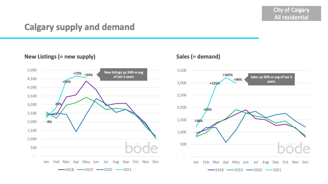
Calgary continues to see demand outpace new supply in the aftermath of the COVID-19 outbreak.
New listings in January were up 34% while sales were up an incredible 90% vs. the previous 3 years. Sales continue the strong trend they’ve been on since July 2020. We expect sales to continue to stay substantially higher than usual for Summer 2021.
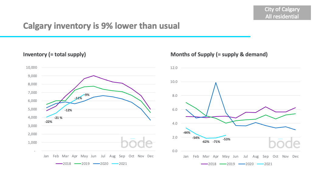
The total number of homes for sale is down 9% compared to the average of the previous 3 years. Inventory levels continue to come back closer to normal.
The combination of low supply and high demand has keps ‘months of supply’ low at 2.3 months which is down 53% vs the previous 3 years.
Fewer months of supply generally makes conditions more favourable for sellers, while higher months of supply is more favourable for buyers.
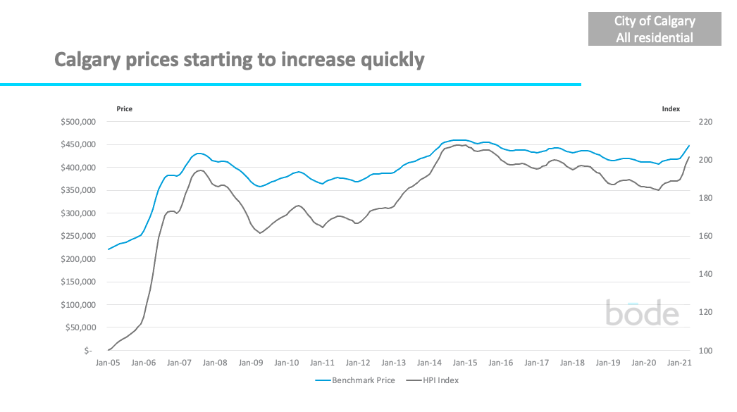
Overall, Calgary prices had been slowly increasing over the last 6 months but have recently started increasing much more quickly. Overall prices are now back to where they were in 2017.
What does this mean for sellers?
Right now supply is still relatively low compared to previous years, and demand is very high which means it is a good time to sell your home. Sellers who price their home well will likely be able to sell quickly.
However, your specific property value will be determined by market forces both within your community and against similar active listings. To find out what supply and demand look like for your specific community, click here.
What does this mean for buyers?
There are currently fewer homes for sale than there have been in previous years. This means active buyers need to move fast to beat other buyers to available listings.
One way you can move faster is by booking viewings directly through Bōde, so you don’t have to wait for a realtor to schedule your viewings.
Market conditions vary substantially by property type, community and price range
Above, we’ve looked at the overall markets for Calgary, but different segments are performing very differently. Let’s look at a few examples.
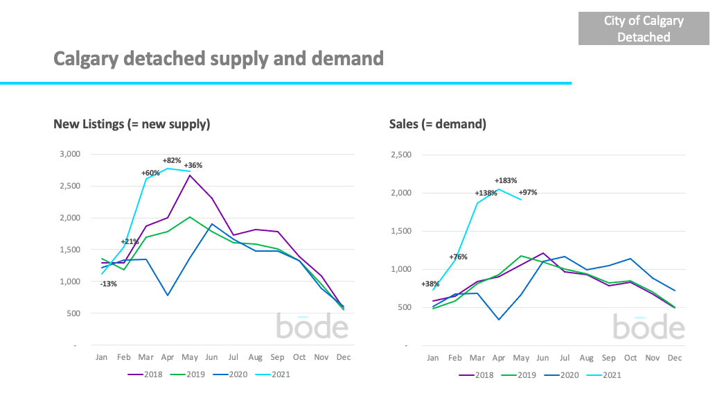
In May, sales of detached homes were up 97% vs the previous 3 years.
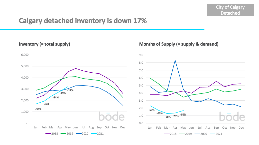
As a result, overall supply of detached homes is down 17% compared to previous years.
This has led months of supply to be down 59% to just 1.7 months, which means it continues to be one of the best times in years to be selling a detached home, and one of the toughest times to be buying as there’s less inventory than normal to choose from.
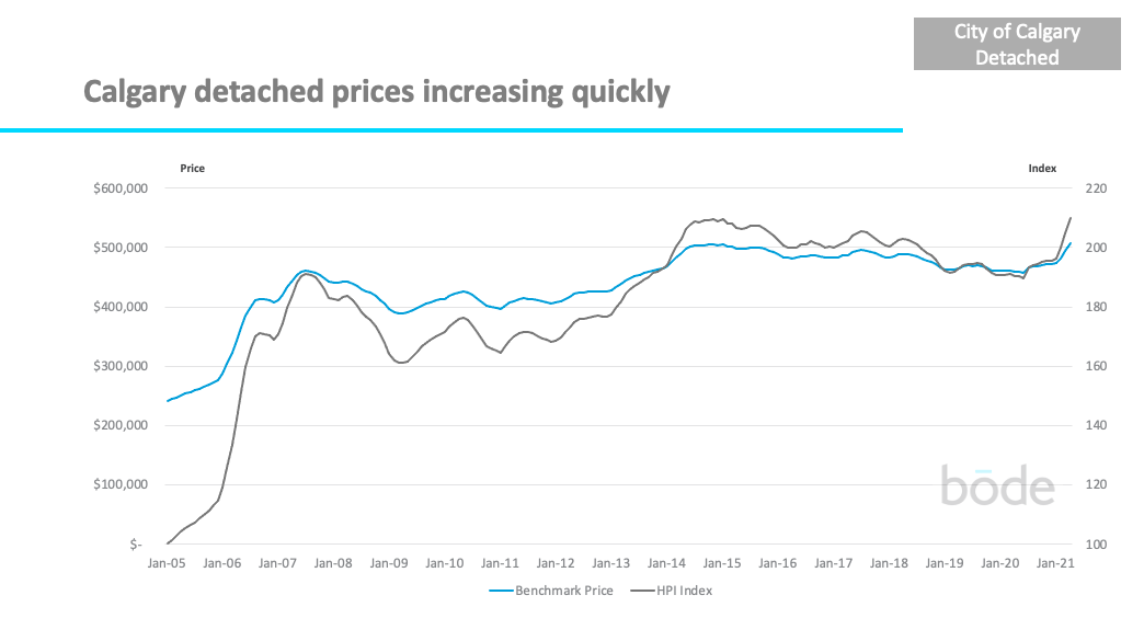
This has led prices upwards quickly in recent months, prices have not increased this quickly since 2014. This has brought prices back up to 2014 levels.
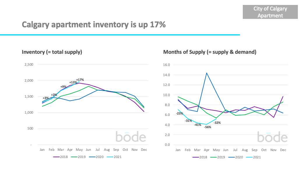
On the other end of the spectrum, there is currently 5.2 months of supply of apartments in Calgary – making it a buyers market.
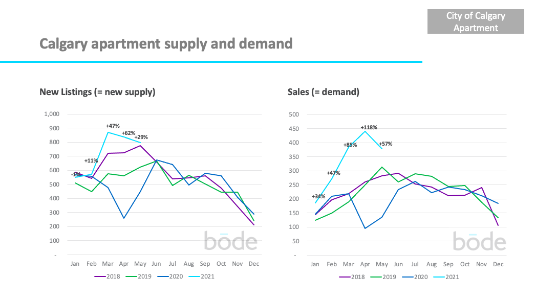
The apartment market has been improving in 2021 relative to a very difficult 2020. Sales were much stronger than usual for May (up 57%).
Despite 5 good months of sales, most of 2020 saw more new listings than sales, so overall inventory (supply) of apartments is still up 17% vs previous years.
Buyers have a lot of apartment options which makes it more difficult for sellers to achieve the price (and speed of sale) they might have wanted.
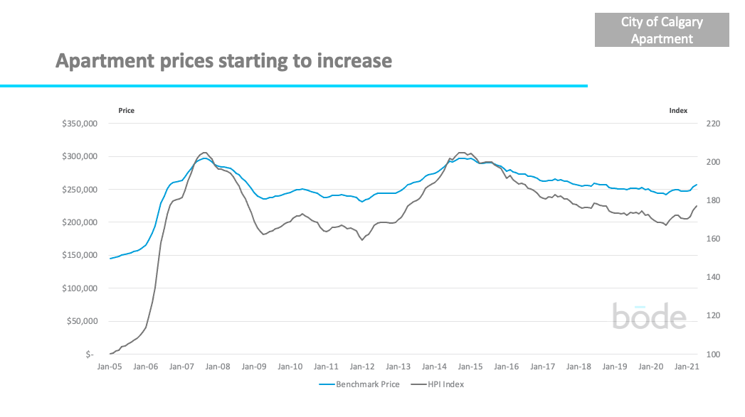
Apartment prices have started to increase after being on a steady downward trend since early 2015.
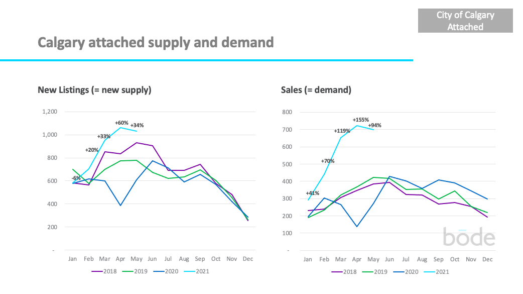
Attached homes (i.e. semi-detached or row homes) saw 34% more listings in May vs previous years. Sales were incredibly strong at +94% compared to the last 3 years.
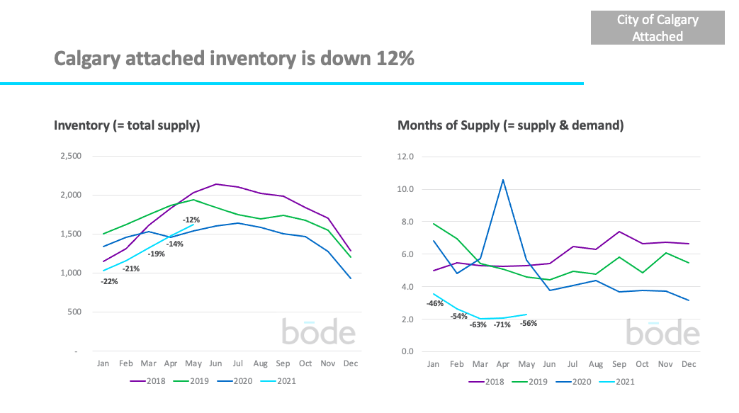
Total inventory is still low for this time of year (-12% vs previous 3 years) however it’s starting to trend back to average. Months of supply continues to stay low at 2.3 months.
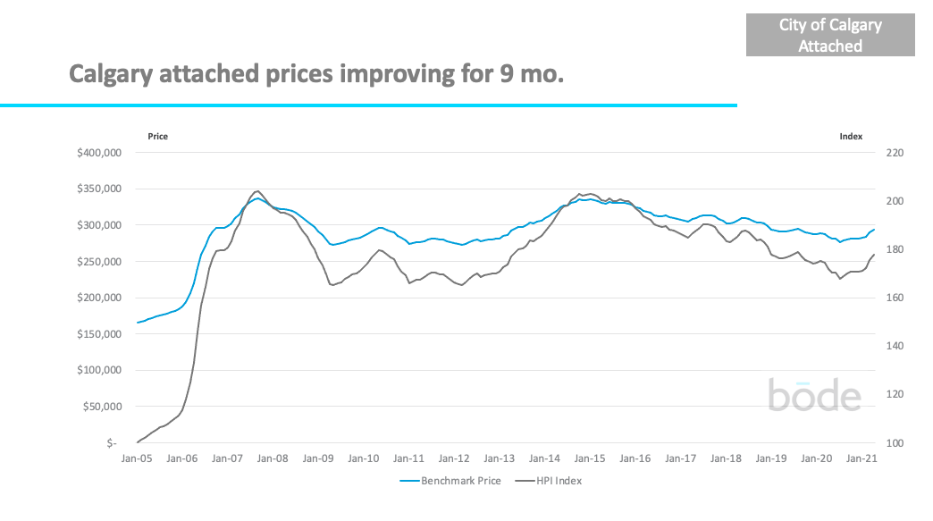
Prices for attached homes have been improving since July 2020 and are back to the price levels of Q4 2019.
In general, you’re in a much better position if you’re selling a detached or attached home right now compared to an apartment, due to less supply and greater demand.
However, what really matters is what’s happening in your specific local property market. There are some communities and price bands where detached homes are performing better/worse, and the same goes for apartments.
It’s critical to understand the dynamics in your local property market
To understand your local property market you need to look at your local data. Head over to Bōde’s new and improved Market Data dashboard, the only place where you can see all the data yourself, including being able to filter on community, property type, and price range to see exactly what’s happening where you live.
You can also see the sold price of any home that has sold in the last 11 years using Bode’s Sold Data page.